'Those Bloomin Creatives'
You can see how the first concept has practically developed below:
Chris began mocking up the idea of using the flower description that come with flowers as potential invitation ideas. We went around Hyde Park sticking these in areas with plants. Again the idea is exploring the play on words - 'Those Bloomin' Creatives' in a sense of flowers and blooming.
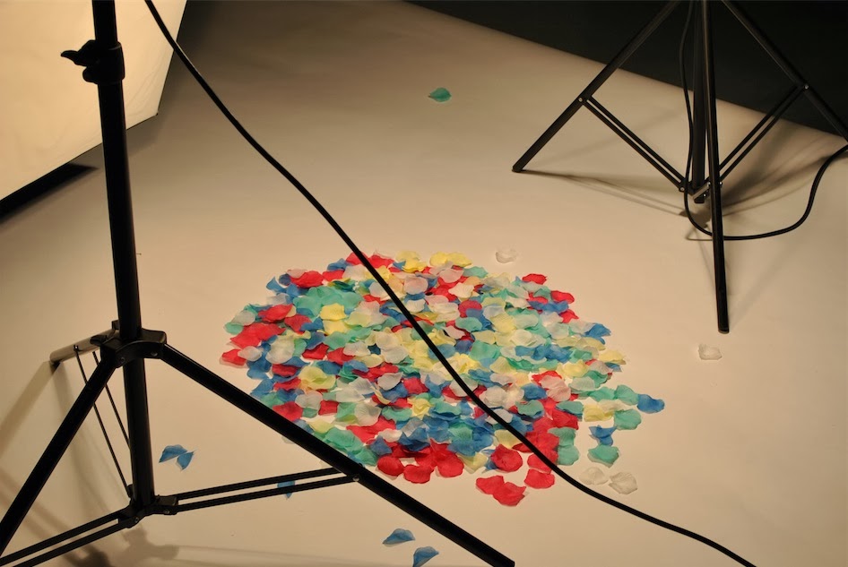
Me and Chris also went into the studio and photographed the petals Chris brought online. We arranged them to a template to create the type. I was quite difficult as the petals were all one size. We eventually decided to cut the petals up so that it was easier to arrange.
One major difficulty was the lighting. We found it hard to get an even lighting.
The second concept:
'It's Grim Up North
We began by experimenting with different typefaces. We need to find a font that can be manipulated easily to create the word 'Great' from 'Grim'. Originally we thought about spray painting or painting the 'Grim':
We decided after deliberation that this typeface once the 'R' had been edited would be best for the poster. We felt like the font connoted 'grimness' and also an old medieval dated feeling. Something we wanted to play upon with the statement also.
We left the kerning of the 'I' and the 'M' wider in order to allow space for the graffiti edit. The 'E' in 'Great' would take more space.
We have also considered lenticular printing that would allow us to send the invites out to people. The only potential problem is price as it may be higher to print then more standard techniques.
Experimenting with paint
After we printed A1 sized posters of the initial concept we began using thick acrylic paint to show the change of 'Grim' to 'Great'. We shot the poster in multiple locations and painted more than one poster. Originally we were going to spray paint the poster but once it was printed it was apparent that the spray paint would be to heavy to use of the poster the scaling didn't match up. If the poster was larger it would defiantly work.
We started thinking about the legibility of the poster and also how different painting techniques would effect the message. For instance, when we only painted the 'I' and 'M' red it looked like we had highlighted the word 'Eat', something that didn't fit into the context of the piece. We need to further experiment with the mediums and also the application.
You can see more locations we tried from the images below.


Leave your comment